
Foodini
An Australian-based Startup

Who?
Myself - UX/UI Designer
Curran Leeds - UX Designer
Lucy Yu - UX Designer
What?
Industry Design Project
Tools Used:
Miro, Figma
Timeline:
4 weeks
ABOUT FOODINI
A mobile app that connects users with allergies and/or dietary restrictions to restaurants


Foodini is an Australian-based startup that helps users with food allergies and/or dietary restrictions discover where and what they can safely eat based on their location. The app gathers a user’s preferences and current location to generate a list of suitable restaurants and online delivery businesses to choose from. It is currently free to use. Our client is looking to grow the business by implementing a freemium subscription model that would offer users additional features at a price.
UNDERSTANDING CLIENT REQUIREMENTS - THE GAPS
Foodini users struggle to find restaurants/businesses that meet their group’s needs
Approximately 1 in 3 Australians suffer from allergies or immune diseases. While Foodini is part of a niche industry, its target group constitutes a reasonably large portion of the population. The app doesn’t allow users to choose multiple user profiles at the same time when searching for menu matches. There is also no way for users to confirm their allergies/intolerances to restaurants and businesses, which affects their perceptions of food safety. Beyond those incapabilities, users can’t accurately distinguish between the restaurants and online delivery businesses in the search results (according to previous usability tests). Lastly, from a B2B perspective, our client hypothesizes that by improving the UI of their website they would be able to draw in more business partners.
THE SOLUTION
Designing a group search feature and a digital allergy card section for premium members to enjoy
Our goal was to design solutions for missing features that could expand Foodini’s impact and business. We designed the process flow for conducting a group search for up to 4 user profiles and how that would be displayed on the screen. We also designed the experience of creating and accessing digital allergy cards for users to present to waiters/businesses. As for the implementation of the freemium subscription model, we designed the process of referring a friend to unlock and gift one month of free premium membership. In order for users to better distinguish between restaurants and online delivery businesses, we added in tabs to allows users to refine their search results to either businesses, online delivery businesses, or both. Finally, the last touch was an improvement of the website’s UI, particularly the Partners page.
Note: simply adding an allergy or intolerance to the current registered profile to generate results won’t work, since it would combine the preferences in the results. For example, if I’m allergic to nuts and you’re allergic to shellfish, adding your allergy to my profile for a “group search” would generate menu items that are both nut and shellfish free. The goal is to clearly indicate which menu item is for which user and separate menu matches accordingly.
OUR ROLES
What did we do?
WEEK 0
Gathered requirements
Understood the problem
Drafted a project plan
WEEK 1
Competitive analysis
Drew inspiration
WEEK 2
User flows
Sketches
WEEK 3
Hi-fi Prototypes
WEEK 4
Usability testing
Website UI recommendations
PROBLEM STATEMENT
Foodini users struggle to find restaurants/businesses that meet their group’s needs and can’t present their allergies to food handlers to guarantee their food safety
COMPETITIVE ANALYSIS
Evaluating how other apps go about similar features
We decided to take a look at how other food-related apps offer freemium subscription models and features like digital allergy cards. We drew inspiration from Equal Eats, Find Me Gluten Free, UberEats, AllergyEats, Doordash, and GrubHub. Our specific area of focus was how apps present subscription models and entice users to upgrade to premium.

Key takeaways:
Users have to be exposed to multiple ways of upgrading to premium:
Seeing banners on the home screen with CTAs to upgrade
Blurring out or “locking” areas that may reveal premium features as a way to tease users to upgrade
Having subscription details come up whenever a user clicks on a premium feature
Digital allergy cards will be accessed through My Account - typically where users can find their “wallet”. This is most intuitive for the user as it is considered personal information that would fall under their profile.
We couldn’t dig up inspiration for conducting group searches, as no other app offers such a feature that caters to individual preferences. We did decide that users will have to perform group searches from the home screen, and that it should be easy to access so that premium users can use it and non-premium users are enticed to upgrade.
As for distinguishing between businesses and restaurants, we decided that adding tabs that users can click on to refine their feed would give them more flexibility to control what they see compared to clarifying the difference through UI changes on cards, which the client didn’t want to do.
TARGET GROUP - PERSONAS
Who are we designing solutions for?
We used the information from previous rounds of user research to create a persona to represent the target user group.

The Foodini target group is comprised of individuals who live with food allergies, intolerances, or voluntary restrictions. They tend to eat out and always have to ensure they can safely eat what’s on the menu.
USER FLOWS
What do the user flows look like?
To translate the experience maps into something more concrete, we built user flows to envision how a user may go through the different red routes. These user flows were designed for an individual like Adam.

Referring a friend to unlock free membership
Users can refer a friend by clicking on a banner located on the home screen. They can copy and send a code to a friend for both parties to unlock free membership for a month.

Conducting a group search
If users are premium members, they can choose to conduct group searches by choosing existing user profiles or creating a new ones on the same screen.

Digital allergy cards
Users can access, edit, and choose their digital allergy cards which would be located in “My Account”.
SKETCHING
What do our solutions look like on paper?
We decided to sketch out our solutions to present to our client prior to designing hi-fidelity screens. We wanted to see if any changes need to be made before committing to designing realistic mockups of our solutions.

Referring a friend and unlocking premium membership
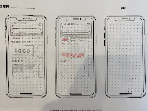
Differentiating between businesses and online delivery services using tabs

Clicking on premium features as a non-premium member would result in an upgrade drawer sliding up

Conducting a group search as a premium member with match results color coded on restaurant cards for each user (up to four users)

Group search results presented in the specific restaurant’s menu matches, with each user having their own color-coded tab

Accessing one’s digital allergy card(s) through “My Account”

Choosing and editing the digital allergy card(s)
HI-FI SCREENS
Turning our sketches into realistic prototypes
Creating hi-fidelity screens was the most exciting part of our project as we brought our sketches to life while maintaining the UI of the mobile app. We designed experiences for referring a friend, distinguishing between restaurants & online businesses, conducting group searches, and choosing/accessing/editing digital allergy cards. On top of the red routes, our client wanted onboarding screens designed that include information about the new features. Our team divided and conquered. I chose to work on the group search feature and the new onboarding screens.

Tabs for Restaurants and Meal Kits to distinguish between the two in the feed & the premium membership drawer that slides up when a non-premium user clicks on a blurred out premium feature.

Copying and sending the referral code to a friend & the payment process (billed after the free month is over)

The process of inserting the code into the app after receiving one and unlocking free membership

Refer a friend banner & the promotion banner for premium members

Group search drawer that slides up when the user clicks on the group search icon as a premium member (similar to a drawer that exists now for switching a user profile)

Group search results that present users with the number of matches per user profile on one restaurant card

Specific restaurant menu matches for each user (fixed tabs)

Users can confirm the allergies they set in their profile during onboarding to generate pre-set digital allergy cards
Onboarding screens prior to additions and UI improvements

These are the older screens used for onboarding. There were some alignment issues with the text and images. The first 2 illustrations were also a little creepy.
Onboarding screens after adding new screens and enhancing the UI

These are the new and improved onboarding screens with additions, a more consistent style of images, and overall better alignment.
USABILITY TESTING
What did we uncover during usability testing?
We were aiming to test our design solutions with 5 participants. However, within a short time frame, we were only able to squeeze in usability tests for 3 participants who fit the target user group. It constitutes individuals who live with food restrictions due to allergies or intolerances.

We tested:
Whether users would notice or click on the ‘Refer a Friend’ banner when asked to upgrade to premium membership
The ease and clarity of the group search feature, particularly if the numbers and tabs on the screen cause confusion
Whether users are aware they can refine their search to either restaurants, online businesses, or both
How easy it is to choose and access the digital allergy cards

Our findings:
We summarized our findings according to how many participants experienced the same issue/confusion
All three users went straight to “My Account” to get to the premium subscription and overlooked the banner which they perceived to be an ad.
While participants didn’t have an issue refining their search to either restaurants or meal kits, they mentioned it caused a little confusion because restaurants and online delivery/meal kits are technically not mutually exclusive.
Two out of three users didn’t know what the numbers meant in the group search results.
Users found it a hassle to navigate multiple allergy cards. They were also against the server or staff swiping or holding onto their phone for a long time.
Potential solutions:
Add a clear and vibrant CTA to the ‘Refer a Friend’ banner to indicate that it is clickable and to draw attention to the area
Dive into user research to figure out how users would best categorize restaurants and online delivery services
Users may not have an issue understanding the match numbers in the group search result after familiarizing themselves with the app, however if the issue persists it would be best to add a label to clearly indicate the numbers are matches.
Having preset individual allergy cards makes it easier on the developer end, however down the road if this issue persists it would be best to merge cards into one readable layout that doesn’t require scrolling or holding for a period of time.
UI IMPROVEMENTS
Recommendations for improving Foodini’s web UI
As the only UX/UI designer on the team with 2 other UX designers, I volunteered to work on the UI improvements of Foodini’s website solo. The plan wasn’t a complete rebranding of their website, but more to do with enhancing some elements on the screen. The Foodini website wasn’t designed on a software like Figma, but I went ahead and designed a hi-fidelity screen of how the updated UI would look like by taking a screenshot of the website’s pages and designing new ones on Figma.

The image on the left is the old design of the Partners page and the one on the right is the “improved version”. I recommended the client add a testimonial section to entice readers to want to become partners. I solved some accessibility issues with the font color and changed the font to match the app’s text style. In addition, the section that displayed the Foodini’s partners was too zoomed in and too long which caused a lot of scrolling and eye strain.

On the right we have a cleaner and more accessible design with better alignment between the elements on the screen. I suggested the client add a separate page in the navigation for the “About Us” section since it contains a lot of text for a home page. The CTAs were also modified to be more consistent with the mobile app design.
CHALLENGES & LESSONS LEARNED
What challenges did I experience in this project?
I would say the technical constraints mostly affected our end results. Since Foodini is a new startup, there wasn’t enough resources to expand the development team just yet, and so our work involved the minimum amount of UI changes that developers would have to work through. The addition of the group search feature was the most complex bit of this project, as it required us to add information on a restaurant card without overwhelming the user and maintaining the current design and understanding of the app. Luckily, a larger restaurant card did exist in the design (in the view all layout) and that was utilized to add up to four user profile matches without it looking so tight.
What did I learn from this experience?
This was my first experience collaborating with other UX designers on a project for a client. I particularly enjoyed working together as team to understand the problem and brainstorm design solutions for new and unique features. I learned a lot from my team members, Curran and Lucy. One of the most important lessons and key takeaways would be to always articulate your design decisions and back up any statements or sometimes “opinions” you may have about a design with reason. Moving forward, i’ll be carrying with me the importance of delivering design decisions with conviction and the optimism of working alongside talented designers.
"Working with Curran, Carol and Lucy as part of the Springboard programme over the last 4 weeks has been amazing. The project which they had to complete was very complicated and required the ability to quickly grasp confusing concepts in a very niche market. They were extremely proactive and engaging throughout the project and met all deliverables with time to spare. Additionally, the quality of work completed exceeded our team's expectations and we are delighted with the result. We will be using the designs provided to introduce new features to our mobile application and website. It was a pleasure working with this team."